UI and UX Design for Mobile Applications
If someone asked you to describe the importance of mobile apps today, what would you say? With every new day, there seems to be more and more new ones in the app stores, some to make our work easier, and some to help us escape our daily routine. For every app we want to have, there are probably hundreds of others, competing attention.
With such a big choice, sometimes it is hard to pick the right one that fits our needs perfectly. Depending on what type of a person you are, you’ll either pick the one that has the biggest number of downloads, or you’ll try a few and make the final decision. At the end, the app that meets your needs will be your final choice.
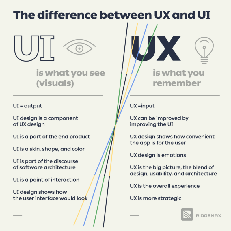
What makes one app better than others is decided by many factors. It can be speed of loading, design of the app, how long it takes to perform an action, is it annoying (too many ads, or push notifications), or how secure it is. The result of these factors is called UX design, and everything that visually guides you through the app is called UI design.
In this post, we will talk about these components of the app, UX and UI, and what it means to create user friendly digital products. Before we start, let’s learn about the main differences between UX and UI.
What is UI?
UI (User Interface) is the most important part when it comes to the structure of the app. UI is responsible for the way users interact with the app, as it decides the position of the controls, brand colours, buttons, blocks and other elements. It incorporates concepts from interaction design, visual design, and information architecture. UI is strictly related to digital products only. UI is a part of UX, but UX can exist without UI. In theory, this is true, but today, in a highly competitive market, a bad UI can badly affect the app performance. A good UI is able to keep users’ attention with visual elements no matter what screen or section they visit.
What is UX?
UX (User Experience) is responsible for building the relationship between the app and users. It goes beyond the app structure and visual touchpoints. As its name says, user experience is one full journey from opening the app down to closing it.
Since we are focused on applying UX and UI for mobile app development, we won’t discuss much about the non-digital application of it. However, it’s important to know that unlike UI, UX design is part of every product you can think of.
Looking from the app development perspective, UI is how friendly the app is. UX is how convenient the app is for the user. To make both convenient and friendly before creating an app, we define personas within the wider target audience. A user persona helps us address the main issues we need to solve, and how to make usability the best thing about the app. When the main goals of the app are addressed, the design part becomes an easy task. As the final point of understanding the UX, here’s a great quote from Helga Moreno:
“UX design is an ‘umbrella’ term. It covers a range of processes and skills that shape a user’s experience of a digital product. These include: research, usability, information architecture, interaction design, visual design, content.”
Creative thinking allows distinctions between apps with similar functionalities. It causes one app to stand out from the rest. Creative thinking refers to smart improvements using different tools and styles to make the experience even more intuitive. It doesn’t mean designers should be trying to reinvent the wheel when designing. If lacking inspiration, it’s a good idea to take a look at your favourite app or UI patterns that proved effective and see how to implement them. Every break from known patterns should be tested with people to make sure they find a new flow comfortable to use.
UI and UX design for mobile apps
Two different approaches for Android and iOS app designs are known as Human Interface Guidelines and Material Design, respectively.
Human Interface Design is all about flat, light, friendly design. More specifically, Human interface guidelines (HIG) are software development documents that offer application developers a set of recommendations, with the aim to improve the experience for the users by making application interfaces more intuitive, learnable, and consistent.
Material design has a set of guidelines and principles: material as a metaphor; bold, graphical, conscious; intentional animation; flexible foundation and cross-platform functionality. It was released as Quantum Paper as a design language by Google in 2014.
Other very important differences, more or less based on these two approaches are summed up in four basic categories:
- basic differences,
- differences in navigation and patterns (UX),
- differences in components (UI), and
- miscellaneous differences.
In this article, you’ll find a lot more information about each of these groups, so make sure to check it out.
In very general terms, Google tends to lean on the human side, while Apple tends to lean on the inorganic side, aiming to send users from one destination to another without distracting from the actual concept. To be more familiar with UI approaches of these two giant companies, try to spot fundamental differences in understanding of human interaction with mobile devices. Starting from there, it will make more sense why users expect different flows on each OS, or even better, why there are so big arguments between android and iOS fans. Now let’s see what tools UX and UI designers use to make outstanding applications.
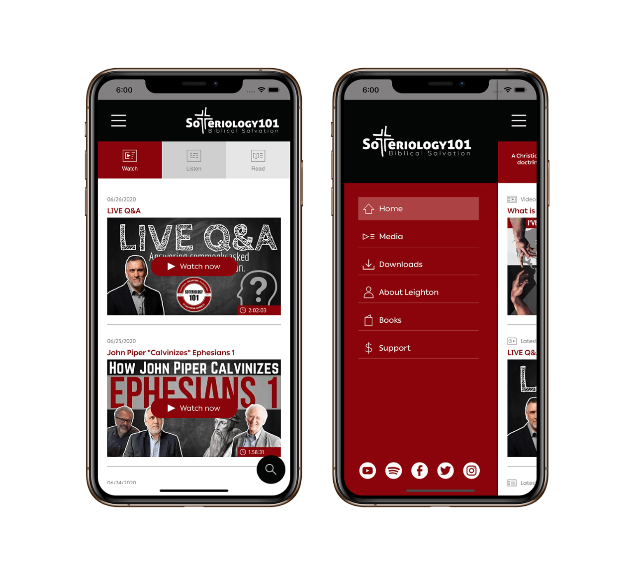
Photo: Mockups Soteriology101
Besides great blogs and courses that teach about UX and UI for mobile apps, there are great books worth reading, such as: Mobile First (Luke Wroblewski), Mobile Design Pattern Gallery (Theresa Nell), Mobile Usability (Jakob Nielsen and Raluca Budiu). When designers speak about design techniques and tools that make their job easier, this is as important as mobile app usability. We made a short list of 5 best tools that are proved as the most effective to work with.
1. Adobe Experience Design (XD)
This tool is rather a whole platform that gives endless possibilities for importing, exporting or even animation designs. Free version has a limited access to some of the features, but it’s still enough if you are just starting out. This is a direct competitor of Sketch which has exclusive support for Mac users only, and without a possibility to animate with it.
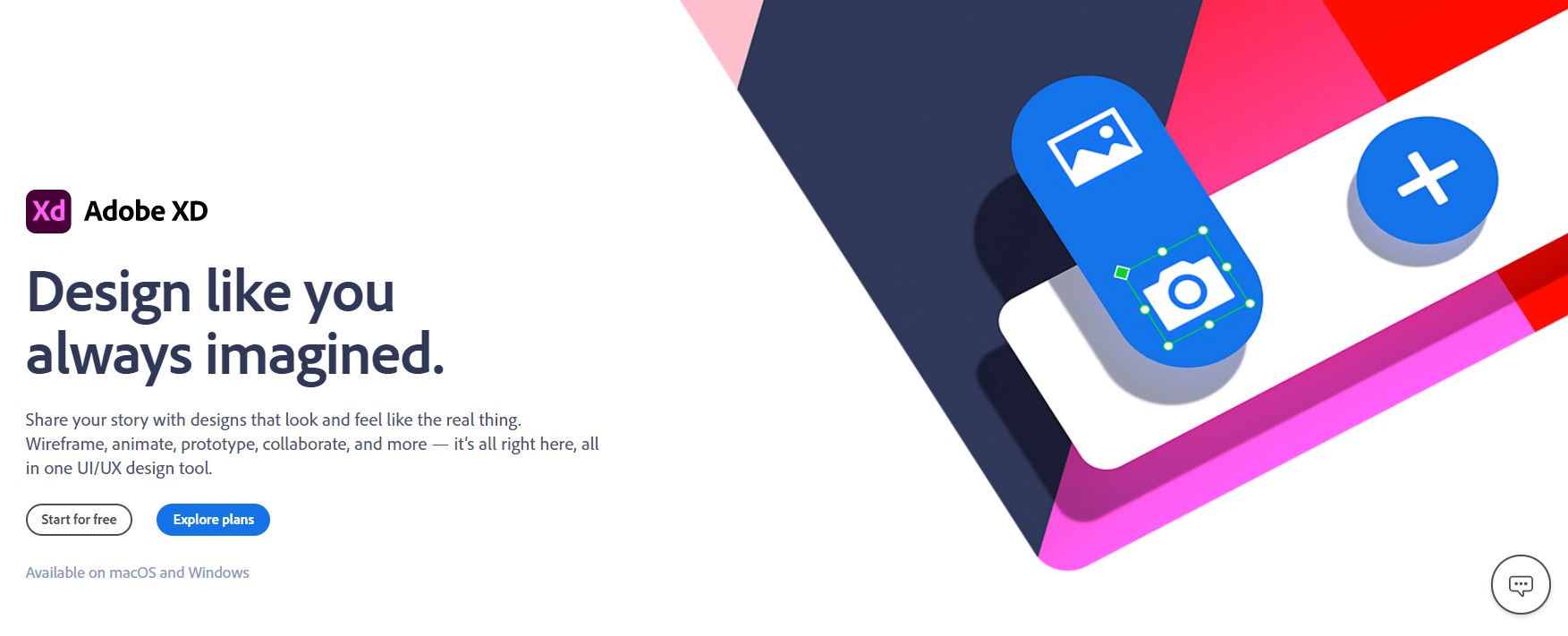
Screenshot: Adobe XD
2. Origami Studio
Origami Studio is another great platform developed by Facebook. It allows you to build interactive components, animate and prototype in one place, and all of that for free. Thanks to a plugin Figma, it’s possible to import editable vector shapes and text layers into Origami and continue working from there.
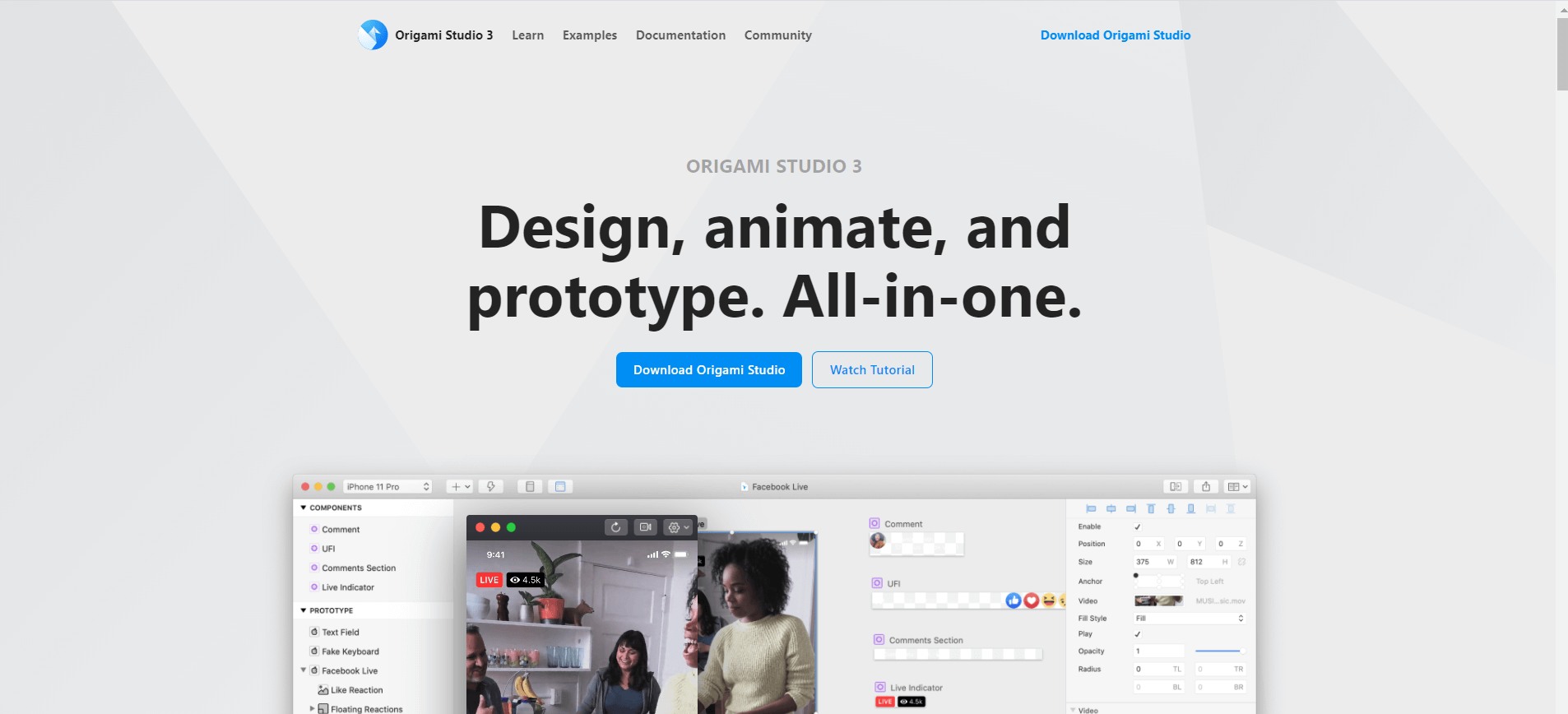
Screenshot: Origami Studio
3. Zeplin
Zeplin is a design collaboration tool that makes work between designers and the rest of the team fun and easy. It provides everything that you need to make the job done, including integrations with Slack, Jira Cloud, Trello est. while designs can be uploaded from Figma, Adobe XD, Sketch and Photoshop CC.
The best thing about Zeplin is that it helps the team be more productive, as developers, product managers, and copywriters can do their job as they can be introduced to the design process early enough.
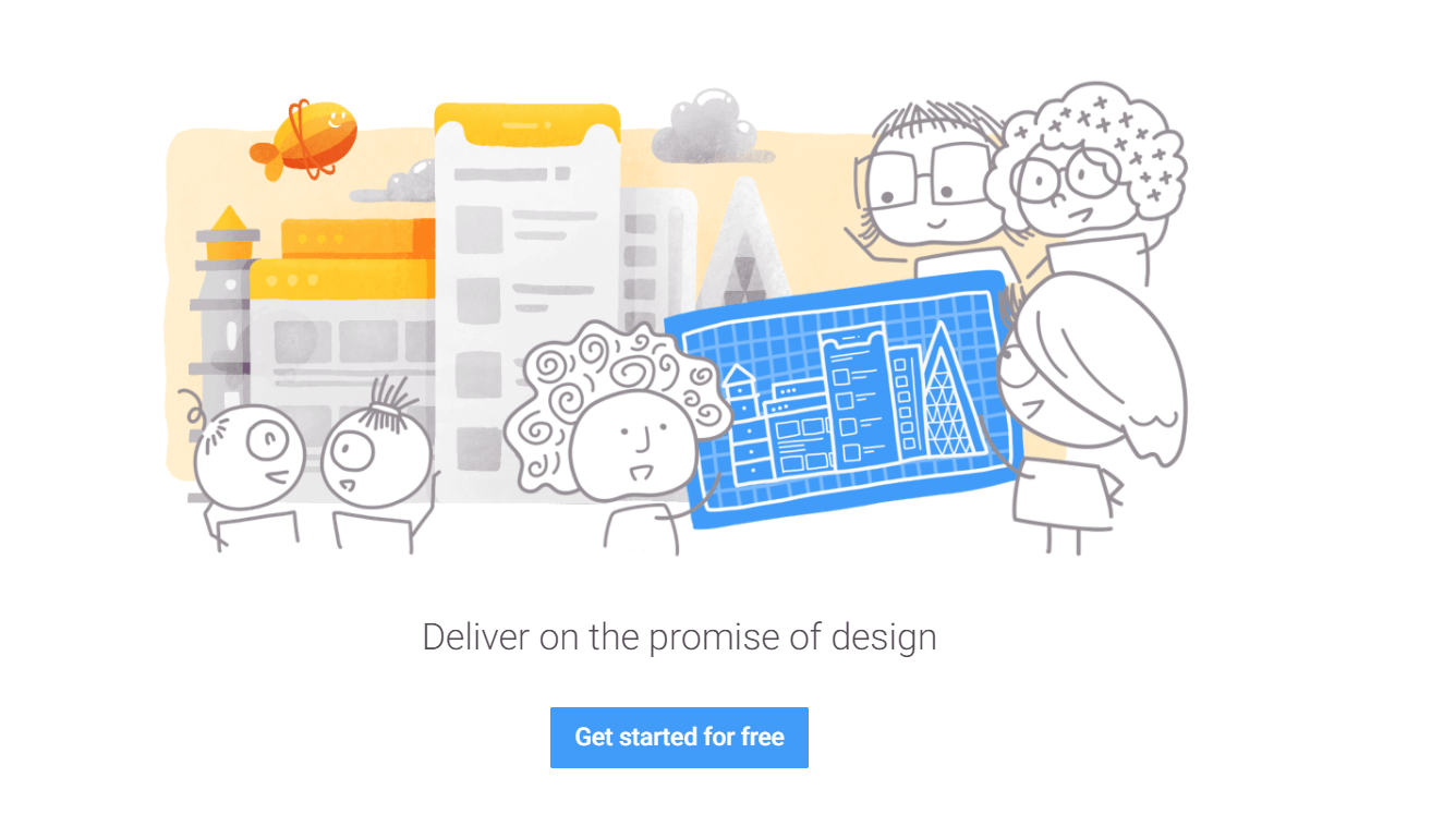
Screenshot: Zeplin
4. JustinMind
JustinMind is a newbie friendly tool that lets you prototype and design wireframing alone or with the team super fast and effectively. It also allows integration with JIRA, Microsoft TFS, Doors.
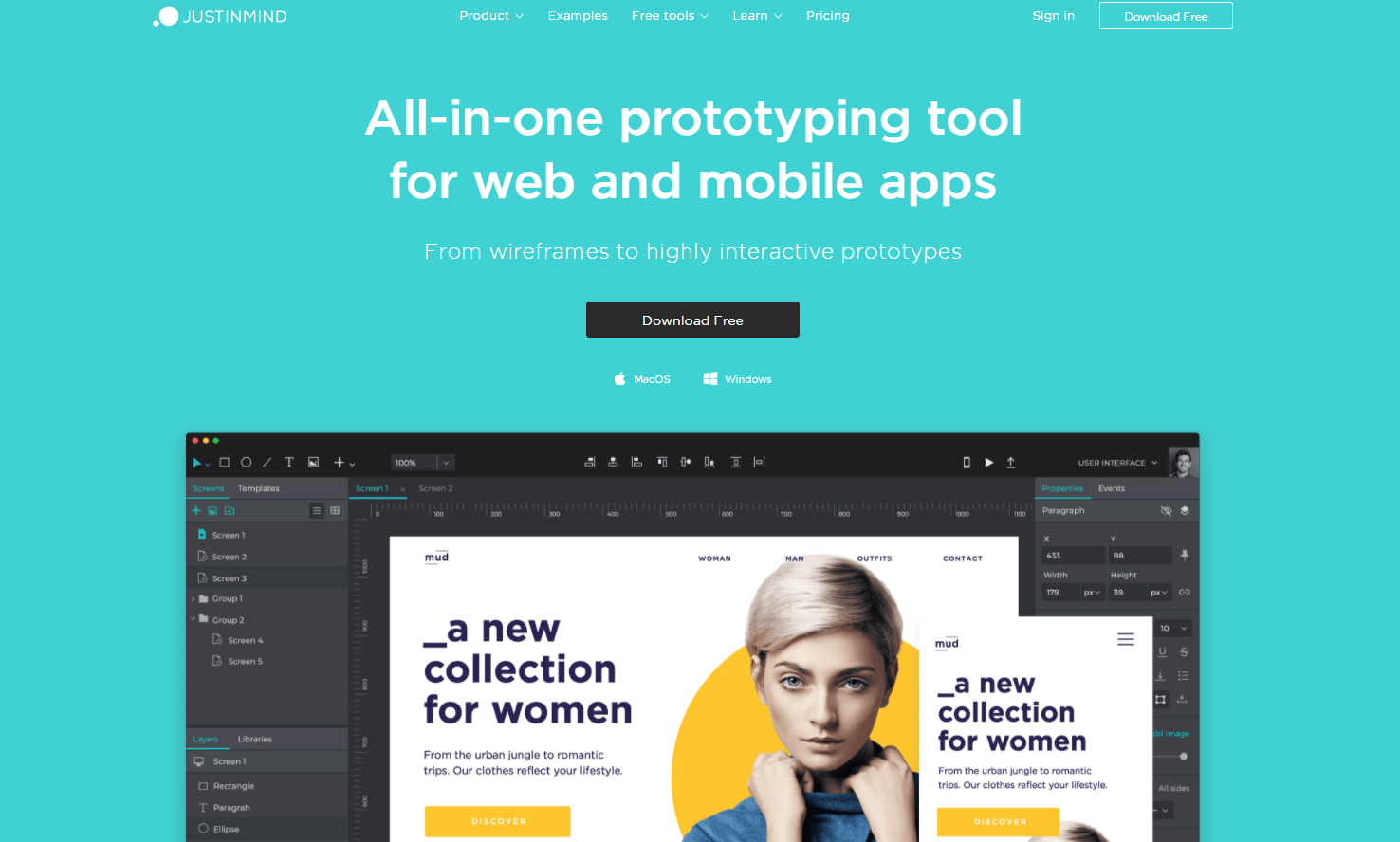
Screenshot: JustInMind
5. Pen, notepad, Photoshop and Illustrator
We could simply split this into 3 different categories, but we didn’t, and for a reason! Illustrator and Photoshop are king of standard designer tools, and very often, the very first digital tools for many of them. But, what came before the digital tools? Of course, a notepad and a pen. No matter how many great gadgets are going to show up in the near future, using a pen and paper will never be an old fashioned way to grow design skills. We already mentioned creative thinking and how important it is for UX and UI designers. Sometimes, the best way to find your inner power is to combine modern and traditional approaches and use it to solve problems for millions of people across the globe.
Conclusion
Creating mobile apps for clients across the world teaches us so much about human interaction, different cultures, but also about the principles that are applicable everywhere. Some patterns are here to stay. Our job is to learn how to use amazing technology to improve people’s lives and make apps even more accessible for everyone. This is the time of human-centred design where buttonless and passwordless interfaces, voice input, face ID, fingerprint scanning, and in-app gestures are about to allow everyone to use technology in ways they couldn’t do before.


